Introducing cluster analysis
There are multiple ways to segment a market, but one of the more precise and statistically valid approaches is to use a technique called cluster analysis. Cluster analysis is a tool that is used in lots of disciplines – not just marketing – basically anywhere there is lots of data to condense into clusters (or groups) – what we call market segments in marketing.
Let’s not be too concerned if the technique sounds too challenging – it’s actually quite straightforward and easy to understand – and you should get a lot of value from using the technique. So let’s start at the beginning – a cluster is a related set of data, things or objects. You might have heard people refer to a group of stars in the sky as a “cluster of stars” – just a group of stars that appear to sit together.
The same concept applies to the market segmentation process – in that we are trying to group consumer data (their behaviors, needs, attitudes, and so on) into related sets. And to help to undertake this grouping (clustering) process, we use cluster analysis to review and create market segments.
A simple example of how cluster analysis works
 To get a quick understanding of how cluster analysis works for market segmentation purposes, let’s use the two variables of “customer satisfaction” scores and a “loyalty” metric to help segment the customers on a database. Let’s assume that we have customer satisfaction (CSAT) scores of 1 to 9 (where 1 = very dissatisfied and 9 = very satisfied). And we have similar scores for the customer’s level of loyalty (1 = high switcher-low loyalty and 9 = non-switcher-high loyalty).
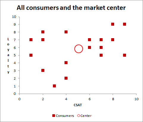
This graph shows this customer database information mapped onto a scatter-plot graph. The red squares represent the scores of the individual customers and the large red circle is the average score of all the customers for CSAT (average = 5.05) and loyalty (average = 5.85).
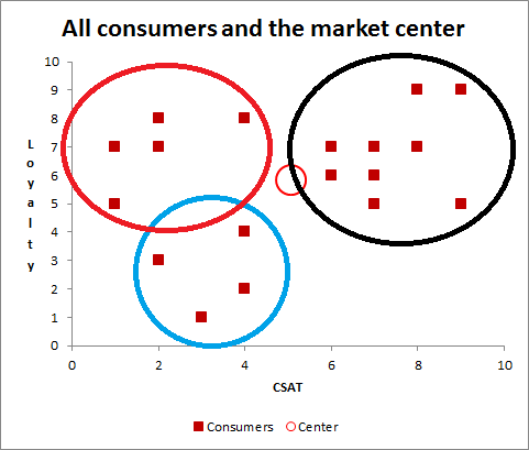 But if we look closely at the plot points – for the purpose of identifying clusters (market segments), there is a suggestion of three possible inherent market segments – this is done using a rough visual basis as shown in the next chart – which the same as above, except for the addition of a top-level segmentation approach (using the extra large circles).
You should be able to see that there are three clusters (segments) of consumers suggested by the data as presented. The black circle (top-right) appears to be loyal customers, with a high level of customer satisfaction. The blue circle (bottom-left) appears to be less loyal customers, with a lower level of CSAT. This relationship is probably obvious and to be expected – and our existing marketing programs (to existing customers) are probably built around this CSAT-loyalty correlation.
However – take a look at the red circle (top-right) – this segment consists of largely unsatisfied, yet quite loyal customers. This is an interesting finding and perhaps unexpected (somewhat of a marketing insight). This is one reason why looking at different approaches to market segments is often worthwhile.
Running cluster analysis on Excel
Note: In addition to this Market Segmentation Study Guide, I have also developed Cluster Analysis for Marketing – where you can download a free Excel template for quickly and easily running cluster analysis.
With the above example – because we are only considering two variables (CSAT and loyalty) – we can attempt to segment the customer data on a visual basis as we have done above. But if we have lots more customers to graph, or if we want to consider more than two variables to create the segmentation, then we can easily use the cluster analysis Excel template (see link above) to construct the segments and produce some helpful statistical measures.
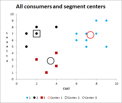 This new graph has been automatically produced by the Excel template – you don’t need to perform any calculations or even have a good knowledge of Excel.
As you can see, the Excel spreadsheet has classified each customer data point into a market segment (e.g. blue diamonds = segment 1), and it has also calculated the center (average) for each segment. In this case, the center (average of customers) in segment 1 is 7.40 for CSAT and 6.80 for loyalty.
What is really interesting is that segment 2 (black dots/circles) actually has a higher loyalty score (7.0) average than segment 1.
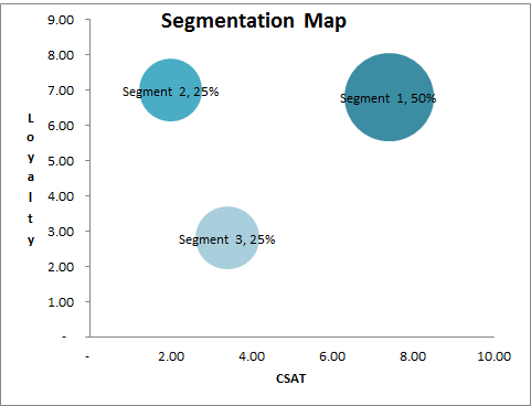 This template for automatically running cluster analysis will also calculate the relative segment sizes for you and produce this graph as well.
As you can see, the segment positions are the same as the previous chart, but without the individual customer data (which is helpful if you have lots of customer data to simplify).
This graph – known as a segmentation map – also includes the size of each market segment, allowing you to measure and forecast the segment and its potential.
Related websites